

CO-OP
Going grocery shopping can be overwhelming. Without planning in advance, people tend to impulse buy things they don’t need, and potentially over or under buy for their week, leaving them with either food waste, or having to eat out expensive meals when they run out of food. Set a budget for the week, and you can be provided with options that fit your budget.
My Role
UX Designer
Tools Used
Figma
Google Docs
Design Process
Empathize
User research
Interviews
Competitor research
Define
Persona
Affinity mapping
Ideate
Brainstorm
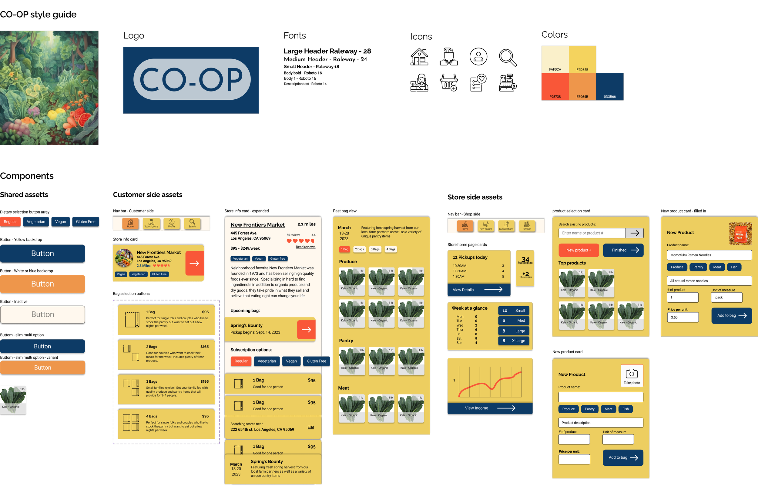
Style guide
Component library
Prototype
Lo fi wireframes
Mid fi wireframes
Working prototype
Reflect
User testing
Priority revisions
Next steps
Research
User interviews
6 Questions
5 Subjects
4 Days
Research Goals
Explore potential problems that people have related to grocery shopping/meal planning
Find out how we can make their lives easier, not more complicated
Understand the way that people grocery shop
Find key features that would be most useful to people
Findings
Food Waste
3/4 subjects listed overbuying food as a problem
All subjects had problems with throwing away spoiled foods that they didn’t get around to preparing
Finances
Most subjects agreed that both price and quality were equally important factors
Preparing food at home is cheaper
Goals
3/4 subjects reported being concerned about healthy eating
Better planning could result in better eating habits
Families face more challenges than single people
Food Buying Factors
3/4 subjects listed price as a primary factor in their grocery choices
3/4 subjects listed food quality as an important consideration in their food choices
Shopping frequency
3/4 subjects grocery shop more than once a week
Buying in bulk requires less frequency
Fresh ingredients need to be bought more often
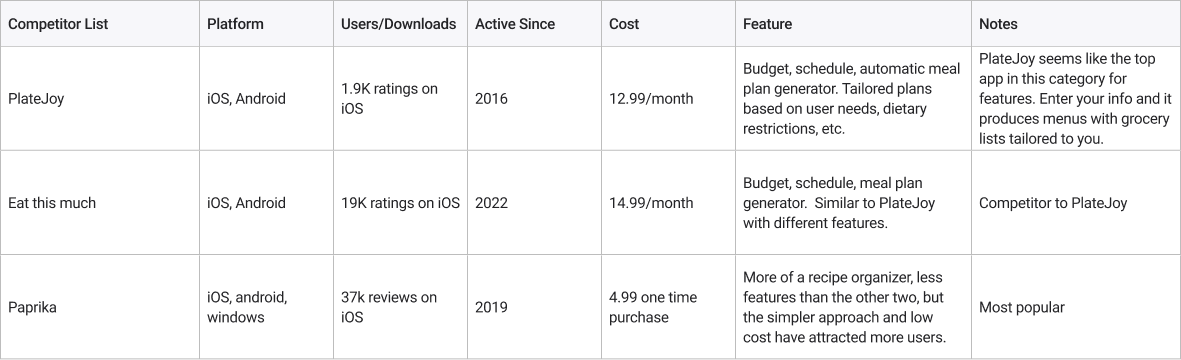
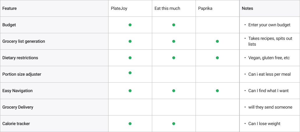
Competitor Research
3 Subjects
Findings
All three apps are extremely broad, which can be good for offering a lot of options. Would users be more likely to use a more straightforward product?
Eat This Much is a little bit more health focused, with a bar code scanner built into the app to track calories of things you eat.
It is difficult to cover every single person’s needs in one app, especially when relating to something as personal as food choices.
Think about a niche that these types of apps don’t cover
Opportunities
Convenience
1
Provide an experience that the user wants to experience again. At the same time, make sure to take people’s busy lives into account.
Health and nutrition
2
Help users meet their goals for health, and consider alternative dietary choices.
Connect
3
People want to feel good about the quality of ingredients they are putting in their bodies, and this connection should be appreciated.
Persona
Finding the user
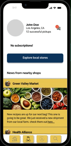
From our research, we found out a lot of information about our potential users. In this case, we have Anna Kim. A working mom who is on the go, and pregnant with a second child. Her priorities are convenience, and making sure her family has healthy foods to eat. We will use this information to inform our decisions in the upcoming sections.

Ideation
Solving the Problem
The Concept
After synthesizing the research materials that we obtained, we brainstormed on possible concepts, and arrived at CO-OP.
CO-OP is a place for users to connect with local grocery stores in their area, and subscribe to grocery pick ups each week. By subscribing to pickups for multiple weeks, users can receive discounts on high quality groceries.
Not only does this provide a convenient way for busy people to get their groceries, but it also strengthens local communities by supporting locally owned businesses.
Feature Priority Roadmap
Now that we have our idea sketched out, we need to parse through our research findings to really focus in on the features that are most necessary. We can see that the main function of the app will be grocery pickup/subscription, so having both a customer and a store facing side is a must.
Must have features
Search function with map feature - use GPS location
Store pages to provide details about near by stores
Past or upcoming product view for users to decide if a grocer fits their needs
Store facing page for building bags for users to order
User home page with details about upcoming pick ups
Store home page with upcoming pick ups, and details
Two sign up flows, one for individuals, and one for stores
Secondary features
Food allergy and preference choices
Different bag sizes at different price points
Perks for long term sign ups, maybe a discount
Subscription tracking and financial tools for stores
Rating and/or review system for users to rate or recommend stores
Long term goals
Social media style feed for recipe sharing and updates from stores
Advertising or promotion of stores at cost
Customer reward system
Real time availability notifications
Prototyping
Information architecture
User Flows
Customer sign up: Our most important flow. We want users to have a friction-less sign up process to get them engaged with the system.
Store sign up: The app won’t work without the stores, so we need to also make sure this is like teflon.
Store bag building flow: This is our most complex system on the whole app. We really need to make sure it is tight and works smoothly so that anyone could pick it up and create a bag.

Lo-fi wireframes
4 iterations
Priorities
Ease of use: The users we talked to are busy, they likely won’t have time to sit down and go through a complex setup process to sign up, so we made the sign up as straightforward as possible.
Options: We want to provide the optimal amount of options here for users. Too many, and we may lose some users. Perhaps going forward we could add additional features that are optional for those who want more options.
Connection: We want users to feel like they are connected to their local area, so we will make all of the search functions start at what is closest to their location.
Store facing side: Stores are also busy, and similarly will want ease of use to be a primary focus. The sign up and building a first bag flow should be as easy as possible to set up.
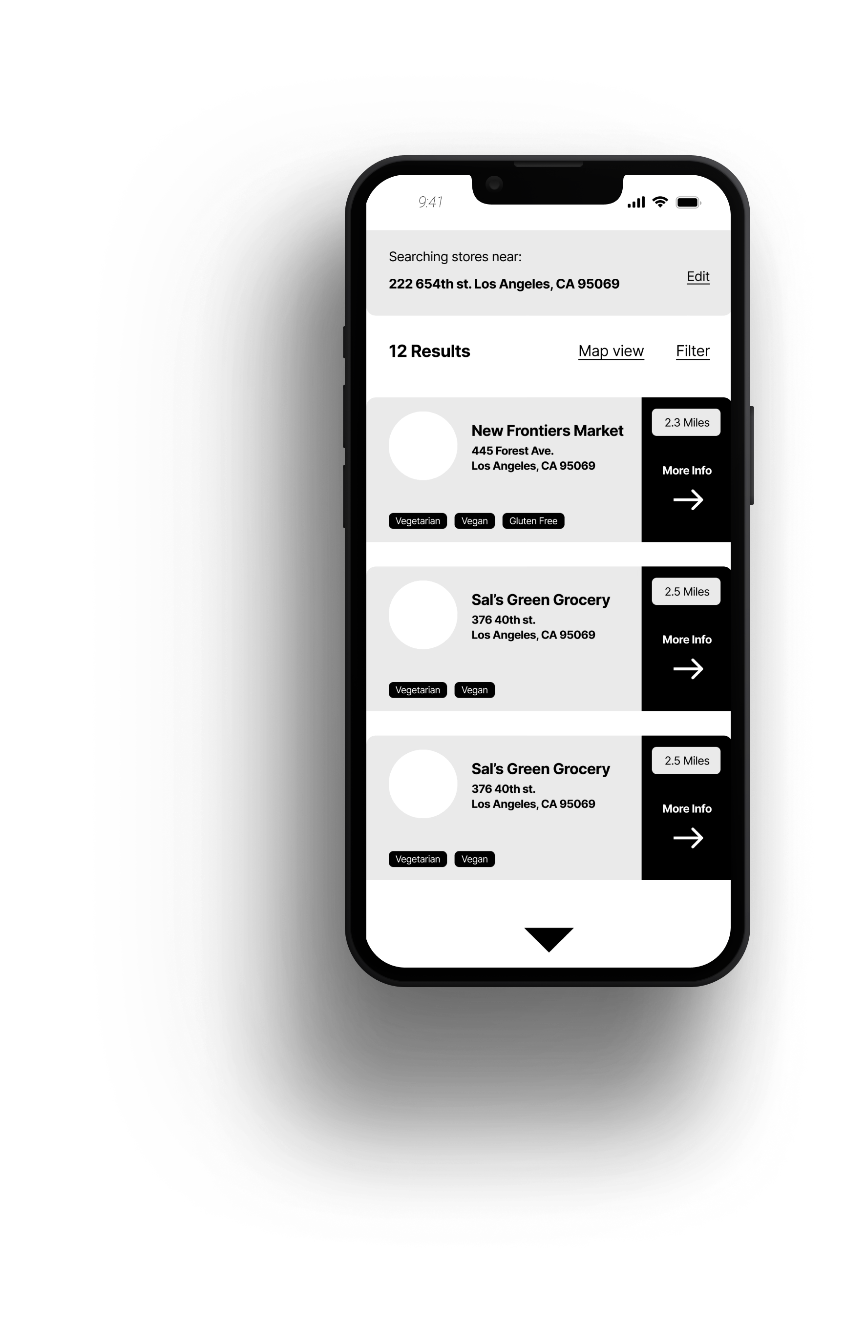
Main Search Page
Customer facing page will be the first thing they explore after sign up. We want to present relevant results based on the users location in a convenient list that can be toggled into a map view.
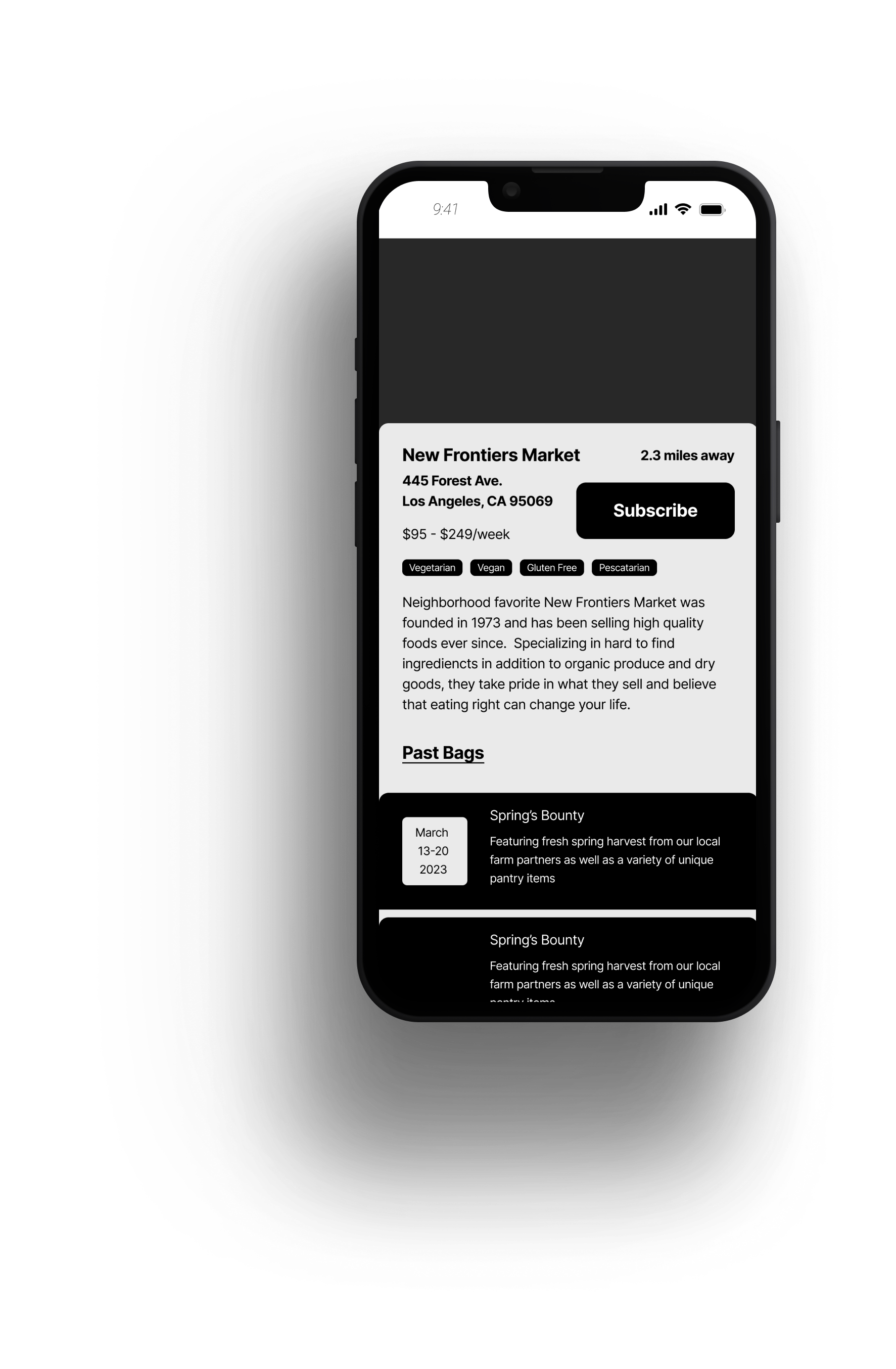
Store Page
Each participating store will need a page that gives general information that would convince the user to subscribe. Here, they can view past bags to see if the store is selling what they want.
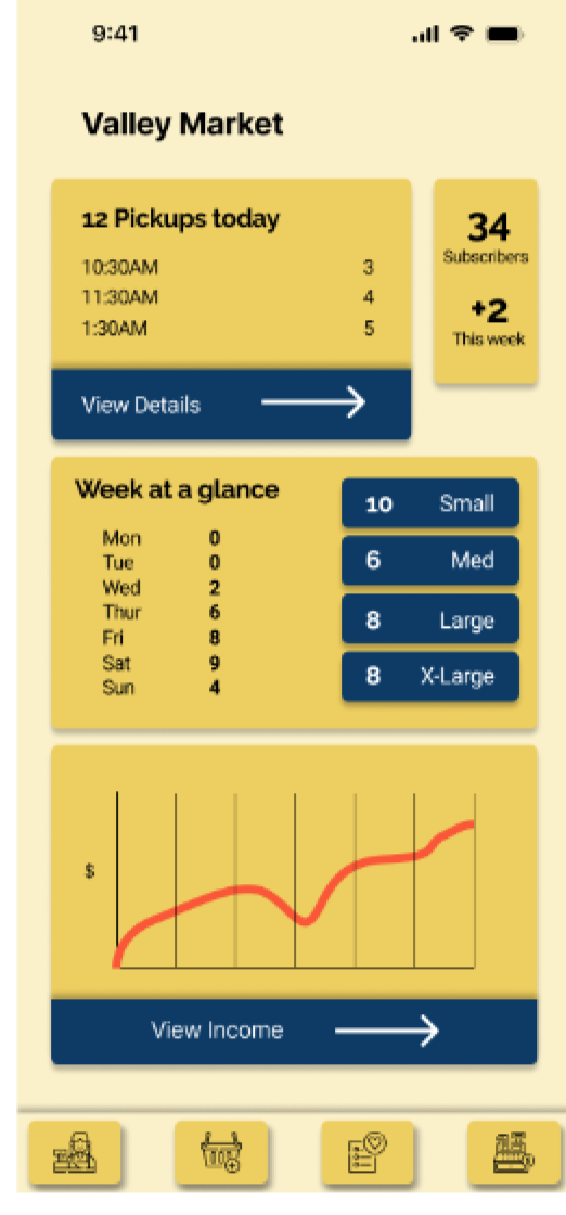
Main Shop Page
Each store will need it’s own home screen with general information about their pickups and sales figures. This allows an at a glance system for the store to keep track of upcoming orders and other details.

Visual Design
Developing a feeling
Color scheme - Exciting, bold colors were used to grab the users attention, and colors were checked for contrast. We want users to be engaged and excited when using the app.
Background - for the sign up flow, we want users to feel comfortable and put across a feeling of nature and well being.
Icons - fun and funky, detailed icons give extra character to the UI, fitting into our overall feel and color scheme.
Fonts - Raleway is a perfect font for our headings, as it has a clean, but fun look that fits our goals. For the body, Roboto provides a legible, clear and concise typeface for readability.
Prototyping
Prototype for User Testing
The major considerations when building our prototype was using color, but also keeping things readable and easy to navigate. By using bold colors for our cards and buttons, we can direct the eye around the screen in the way that makes the most sense for usability.
User Testing
Tasks and success criteria
Task Flow: Subscribe to New Frontiers Market two bag option for pick up on September 16 at 10:30 AM. At checkout, add the extra month to gain a discount. Return home to see the details.
Success Measures:
Completing the task
no errors
ease of use
time taken
Stumbling Blocks
Choosing a bag - users wanted to be able to view the contents of the bag before subscribing.
In addition, 2 users needed to be prompted to select the 2 bag card from the selection screen
Nav text - subjects were confused by the nav buttons - adding text underneath will help
Dietary restriction cards could be larger, and a selection point is needed to make sure that they get selected properly.
Signing up for a month vs. one time - how can we make this more clear and easy to understand?
Suggestions
Add text under nav buttons to clarify sections
Potentially shorten the shop/bag selection process into one screen instead of having extra step
Make dietary restrictions more prominent and make sure they are selectable
Clarify and reenforce monthly sign up discount
Final Designs
Search Results
V1
V2


Priority Changes:
Explore more white space on screen: The cream background may not provide enough contrast according to some users during testing. Using a white background may make the designs have more impact, and make it easier for users to follow the process.
Store home
V1
V2

Priority Changes:
Add text under nav icons: Since we are using more detailed icons, we need to make sure that the user can easily and quickly know what each one means without having to guess or explore.
Additionally, we added a messaging alert in the top corner to help keep track of customer messages.
In future steps, we may consider having some kind of feed control/posting part of this screen as well. Sharing recipes and other info will be an important part of the store side.
Hard sell screen
V1
V2


Priority Changes:
Clarify and rework selling page for month long subscription discount: How can we really clarify and make this appealing to users? This is the selling point of the app in some ways, as the subscription discount is a huge bonus, especially for those on a budget.
Cleaned up overall appearance and offered two clear choices.
Store info
V1

V2


Priority Changes:
Rework store card/bag selection area: There may be unnecessary extra steps here that we can shrink and optimize.
Instead of exploring past bags being upfront, the soonest upcoming bag, or the most recent bag, will be available to view.
The dietary restriction cards have been enlarged and made more prominent and selectable.

Next steps
Build working prototype of store side flow, focusing on building a new bag, and how this will work.
Considerations include:
Who will build the bags? The store manager, or employees? We need to make sure anyone can jump in and build a bag and share it easily
Keeping track of subscriptions. This will likely be the most complex part of the store side, as we need to make sure it is simple for stores to view their upcoming pickups, as well as mark pickups that have collected
Begin more testing on customer use flow and continue to iterate and optimize
Put everything together into a working prototype of the entire app to do further testing
Consult with development team to work out any problem points in regards to coding
